Search
Trending Songs List
Why this change?
1
Spotify's Search page organizes music by genres and categories, but it doesn't surface what's currently popular. Introducing Trending India and Trending Global helps users discover trending music faster while fitting naturally into the existing browsing experience.
Current


Improved


Trending Global
Trending India

Why this change?
1
Users currently need to scroll and then tap to view lyrics. Adding a Show Lyrics button provides instant one-tap access while keeping the playback controls in the same place. This reduces interaction and makes one of Spotify's most-used features faster to access.
Current

Improved

Show lyrics
1

Rating Card
4-Star Rating Feedback
1
Why this change?
1
Users often shop within a budget. Showing the item price directly in the cart lets them track spending without opening the cart every time.
2
Blinkit's bottom navigation should support the main shopping journey. The District tab opens another app, while Wishlist is a core shopping feature already available inside Blinkit. Replacing it keeps users focused on shopping, while Print is separated because it is a service, not part of the primary shopping flow.
Current


Improved

₹438
1
2

Wishlist

Cart & Navigation
Improving the Shopping Flow
Why this change?
1
Users mostly visit the Money tab to check their balance or recent transactions. Loan offers and CIBIL score are already available on the Home tab, so they don't need to be prioritized here as well. This change reduces duplication and gives more space to users' primary task.
Improved


₹
Money

Current

1

Money Page
Prioritizing Essential Tasks
Why this change?
1
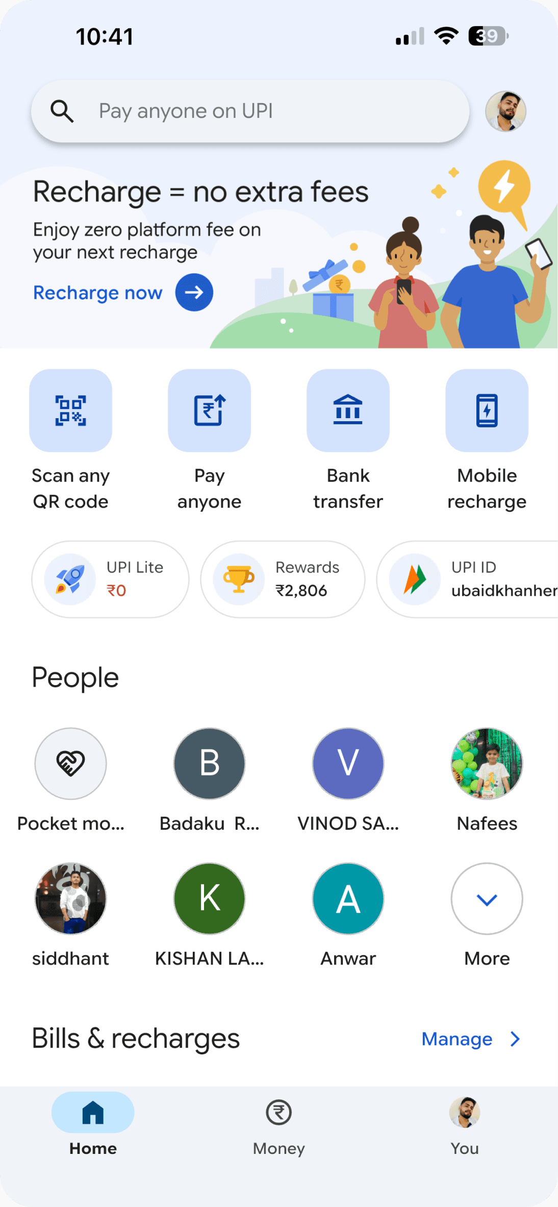
The profile is already accessible from the top-right corner, so keeping another profile tab in the bottom navigation creates duplication.
2
5
Scan QR now has a dedicated place in the bottom navigation. Scan QR gives users instant access to Google Pay's most frequently used feature from anywhere in the app.
Pay Anyone is already accessible through Search, and Mobile Recharge already appears in the Bills & Recharges section below. Removing these duplicate entry points keeps the quick actions focused on unique, high-priority tasks while making room for Self Transfer.
3
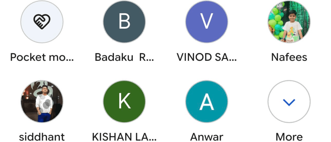
Rewards is already available in the profile section, Replacing Rewards with Check Balance reduces duplicate entry points and prioritises a more common everyday task without removing access to existing features.
4
Personal and business contacts serve the same purpose but are separated in the current experience. Combining them into a single section with tabs keeps related content together and makes switching between personal and business payments faster.
Current
Improved




People
Business

Check Balance
₹


Bank Transfer

Self Transfer


1
2
3
5
4
Home Page
Simplifying the Home Screen

Home Page
Quick Food Search
Current

Improved


Search

1
Why this change?
1
Users can only search for food while adding it to their diary. Sometimes they just want to check calories and nutrition before deciding what to eat. A dedicated search makes this faster without having to start logging food.
The More section is used less often, so moving it to the top makes room for a more useful feature in the bottom navigation.
Why this change?
1
The feedback options don't match a 4-star rating. A 4-star ride usually means the experience was good, but not perfect. Users who face issues like unsafe riding, no helmet, or extra charges would likely give a much lower rating. Showing positive, improvement-focused chips would better match user intent and collect more accurate feedback.
Current

Improved

More Polite
Cleaner Vehicle
Less Waiting Time
Smoother Ride
More Comfortable Ride
1

Rating Card
4-Star Rating Feedback
One Small Fix
Small improvements. Better experiences.